A Hobby Lobby recently opened nearby. I’d never heard of it before so the other day i went over to wander around and check out what they had. It’s your typical warehouse crafty supply store like a JoAnnes or Michaels with some notable differences that struck me as odd. Specifically, their signage. Signage can tell you a lot about a business. “We reopen at 10am” sends a whole different message than “CLOSED” – that being “we value your business” versus “go away!”
Here’s what i learned from Hobby Lobby based purely on their signage:

aka “only traditional Christian values are important”
Their website says they’re closed on Sundays. Okay, no biggie. Even though sunday is usually the day i randomly decide i’ve got time to fit in a project and end up needing supplies at the last minute, I can drive the 20+ mins to Joanne’s/Michaels.
However, its this sign – the reason they’re closed Sunday’s that strikes me as strange. If they are closed on SUNDAYS and they do so to allow their employees to worship – does that mean they don’t employ any Jewish or Muslim people? Possible, i suppose, by complete accident. Hopefully not by design.
They could have just said “closed sundays.” No explanation needed.


aka “we have rules here”
they must have had a previous incident with this in one of their other locations because at the top of every aisle, on both sides, is this double-sided, fairly unwelcoming stop-sign type sign telling you to NOT remove items and to NOT climb the shelves.
Okay, i can understand they won’t want people being stupid or getting hurt (or law-suity) but its the excess of all these signs that bugs me. they’re everywhere you look!! At first i thought that these were directional signs because of their placement – high enough to see from afar and at the corner of every aisle. Not the case. and very unwelcoming.

aka “if you wander around lost, you’ll see more to buy”
I was wandering around when i first got there because i wanted to see what they had. It wasn’t until halfway through the store i realized if i had a specific item in mind, i wouldn’t be able to self-service and find it very easily – there were no overhead directional signs!
It’s the lack of signage here that speaks volumes. I ended up speaking to one of the folks on the floor and asked when they opened. When she mentioned that it was only a few days ago I said, “oh is that why there’s no overhead signage – they’re just not up yet?” “No,” she said, “Hobby Lobby doesn’t do that.”
Doesn’t do that? I haven’t asked management what their theory is on signage but perhaps they put such a premium on their sales team being able to help you, and being ever-present that you won’t ever need to read a sign even if they had them! In other words- while sometimes it takes more time, the human connection is of utmost importance. Or, they figure if you wander around lost, you’ll find more stuff you “need” and will buy.
Another sales person i spoke with mentioned that the “art” that is on the outer walls of the place, lining the whole way around the store are the “clues” to what’s in each aisle. (she did say “clues.”) It wasn’t until she said that that i noticed the “art” was anything other than just wall-decor. It indeed told you what you might find in each aisle. That is if you had insane vision and could a) see that far and b) could see through other aisles that were blocking signs other than the ones you were directly in the path of. Fail, if you ask me.
What does your signage say about you?
Not sure? If you’ve been staring at your signage so long you no longer see it, perhaps it’s time to bring in fresh eyes. Like your recent hires, or *gasp* actual customers. Ask them what your signage says about you- and be prepared to act on it if change is needed.
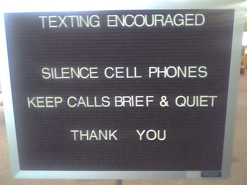
Take a look at all your signs, but specifically the ones that mention your cell phone policy. These are the signs that I’m always shocked they’re worded the way they are.

“NO CELL PHONES” isn’t really what you’re trying to tell people. Is it? With apps, texting, and other non-vocal (and therefore potentially non-disruptive) things you can do with a cell phone, this is NOT the sign you should be hanging.
Perhaps you meant to say:
Also on signage:
- from ugly to beautiful: a remake of library signage (the strange librarian)
To me, the signs encourage “rule following” over “customer assistance”. Where can I as a customer find something? I’m not sure, but I’m pretty sure that if it’s on a Sunday or on the top shelf of an aisle, I know what is going to happen. That doesn’t answer my primary reason in being in the store (to find something or to browse based on interest). While I applaud them for not being too excessive with the signs (based on your pictures, granted), but still, there is something to be said for being vague or not helpful at all.
It’s a shame, really. Signs in retail can be so effective; and people expect a certain amount of them. But when it comes to the library, the biggest irony is that it is a place of reading and no one reads the signs. And the ones they tend to read, they are usually written in a negative tone.
Maybe that’s why the profession is so down on itself at times. We are like a denial parent, used to telling people what they cannot do or get. Maybe we need something more positive around us, right?
Signage in libraries tends to be negative, as you said, Andy, and in too much qty. If we looked to our buildings with a design eye, minimalistic, and made sure that the signage we had was limited, eye catching, informative, and positive i think people would actually *see* them and *read* them. That said, i think even just moving things around would help – people tend to stop seeing things after a while – shaking things up would put things back into view.
As for the positivity, we come from a long history of information keepers. huge locked doors, etc. The more we can separate ourselves from that, the better we’ll fare. With a customer service and business eye we shall prevail.
It’s important to understand the subconscious meanings that signage can infer, and what connotations they may evoke in different segments of our service population. There are really no small details in signage – you are conveying a message using just a few words and symbols, so it’s a good idea to choose them wisely.
In the first sign up there (the store hours), the choice of words seem to be especially chosen to evoke that “We embrace good old American values” sentiment that appeals to what must be their key demographic. Family. Worship. Mom. Apple Pie. To you, it reads “exclusionary”, but there are many others to whom this kind of a sign reads “this is a company that values ‘traditional’ values like I do.”
The second is interesting… it used the Stop Sign symbol and red warning color and sandwiches a stern warning between the much larger “please” and “Thank You.” So it’s not just “we have rules here”, but also “We remember our manners”. Sure, it seems unwelcoming and a little excessive. But it also positions the store management as an authority figure (You MUST obey the Stop sign – it’s the law!) and sets the tone by suggesting that there is a certain decorum to be followed in this environment.
Stuff like this is not designed by accident. Stores do a lot of work to ensure that all of the signage, language, etc. they use reflect their core brand and reinforce their essential messages. Unfortunately, libraries don’t usually do the same thing, which gives them a distinct disadvantage in creating a goal-driven retail environment.
If your goal is to keep the library reasonably quiet, then that’s what you should say, using carefully chosen wording and symbols that will communicate the exact message you want. Is that really best done with a black and white (deadly!) capital letter (YELLING) sign banning the device (not really what you want)? Nope. But I doubt that the sign designer was thinking of any of that.
Where did u actually get the techniques
to create ““what your signage says about you | the strange librarian”?
Regards -Stacie